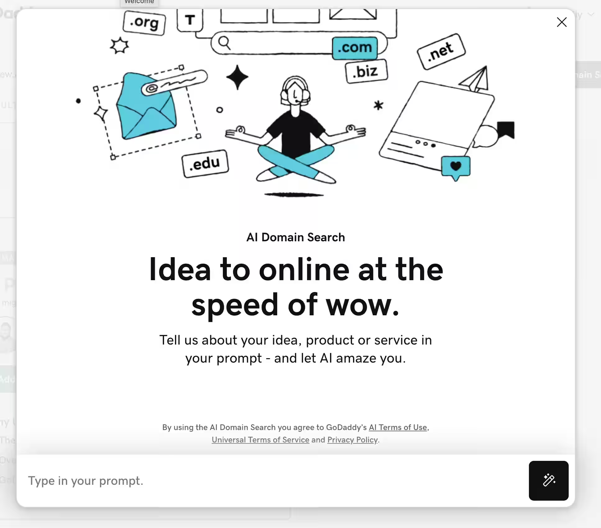
For many products, the first touchpoint with AI is through the Initial CTA: A prominent collection of inputs and actions that allow a user to start prompting. From here, the user works with the model through regenerations, variants, and other actions in order to reach their intended goal.
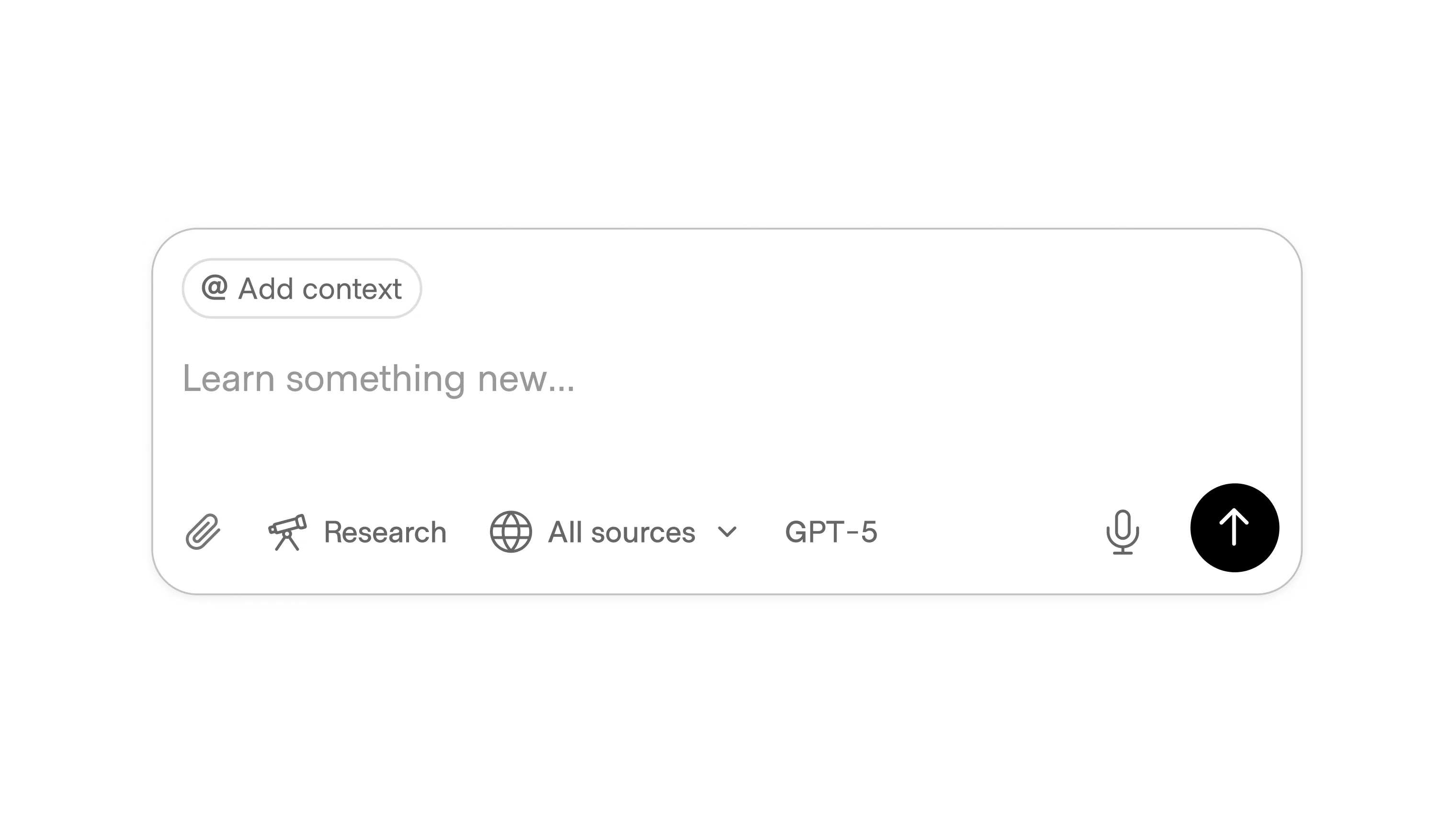
The most common implementation of this pattern is a large direct input box, where the system goal is to understand the user’s context and intent as quickly as possible while minimizing the amount of work they have to do to express it. The implementation of this pattern varies depending on the context and capabilities of the surrounding application.

The direct input has become the default starting point in AI products. It’s approachable, lowers the barrier to entry, and shows off the product’s flexibility and capabilities. However, it also surfaces the hardest part of prompt engineering: most people don’t know how to phrase what they want, and a short prompt rarely captures the nuance of their intent.
Even experienced users often need multiple iterations to get to a strong first draft. This can frustrate users. It also has a real cost: running those unstructured queries isn’t free, and compute costs rise quickly when the system is forced to guess.
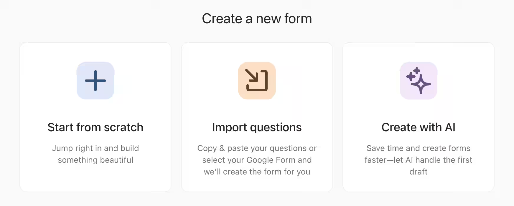
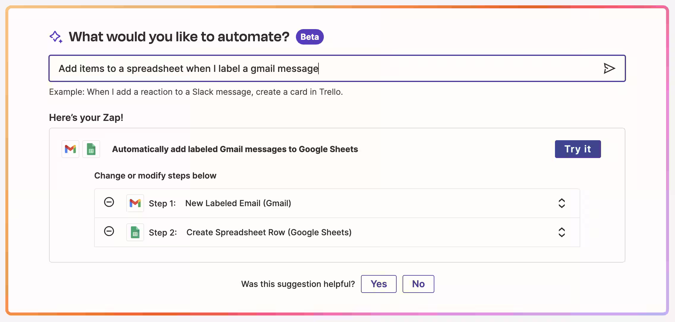
The more reliable path is to keep the input box at the center but surround it with supportive actions operating as scaffolding. Instead of relying on a single sentence, users can layer context, choose modes, or start from predefined actions. This shifts the work from prompt engineering toward selection and refinement, while still keeping intent capture in the text field.

The input box still captures intent, but the surrounding scaffolding carries the weight. This approach makes the system more forgiving, reduces wasted compute, and dramatically increases the odds that the first output feels useful.
For products where AI is a feature but not the foundation, its functionality is introduced alongside foundational features. In these contexts, the open-ended functionality is presented as an easy way to complete a task. Supportive features are used for action-oriented CTAs as well, but focus specifically on completing the action using wizards, templates, and workflows.

In these cases, AI functionality is often introduced through a dialog or banner, but again, discoverable in context. Some products hold back the AI until there’s something useful to act on. Instead of prompting cold, the system waits until data exists, like a transcript, a backlog, or a set of files, then surfaces AI as the natural next step. This approach avoids wasted queries, reduces compute load, and ensures the first output feels relevant.

Finally, some products lean on play as the best entry point. Instead of making users stress over phrasing the “right” prompt, they invite experimentation through humor, randomness, or creative surprise. This lowers pressure, shows range, and turns the first interaction into something memorable.

Playful scaffolding often comes through whimsical suggestions, randomized galleries, or one-click transformations. Udio, for example, seeds the input with absurd but delightful ideas like “a motown-esque song about how much I hate work” or “indie-rock ballad about a cat in love with a bird” FigJam uses quirky templates and remixable starters to spark creativity without requiring any writing. Other products lean on immediate examples or instant variants, so users can explore possibilities without worrying about precision.
The design lesson is that delight can be scaffolding too. By offering playful prompts, galleries, or remix tools, you reduce the risk of wasted compute on unworkable input and encourage users to explore without fear. This approach may not deliver precision, but it does elicit curiosity and confidence, important emotions to help users feel engaged.